 CALL US


Mobile navigation design is all about getting users where they want to go, with the least amount of friction possible.
Good mobile navigation will boost the usability of the entire product, helping users to enjoy ll the features offered. Bad navigation will make it difficult to find things, making it less likely that users will ever experience the product the way the design team had envisioned. This is the kind of thing that can make or break any mobile app. That is how important the navigation design is.
What Is Meant by Mobile App Navigation?
Navigation in general is something that shows you the way to reach your desired destination. When talking about mobile app navigation, it refers to the same concept, guidance.
Mobile app navigation refers to an app’s elements that help users jump from one point to another within the app. This incorporates mobile navigation for users to easily find what they want. This helps you guide the user around the app with important buttons representing areas you want your users to go.
Choosing the best mobile navigation for your app is an indispensable area of your app that aids in delivering a high-quality user experience.
What Is the Function of The Navigation Menu?
To enhance the product content and function structure and hierarchy – Navigation is the skeleton of the app, supporting the overall content and information so that content in accordance with the information architecture is organically combined, and visually displayed in front of users so that fragmented content becomes full and orderly. Meanwhile, the structured arrangement at the same time also enhances the sense of ecology.
Highlight the core functions – An app’s core functions are what you want your audience to recognise first. Navigation defines the app’s key features effectively. Those features are presented in a way that the users can catch them easily. And the proportion of the secondary function should be controlled to avoid distraction. You can achieve this through appropriate navigational design.
Simplify the user journey – a reasonable navigation system and a smooth path to the desired task allows users to quickly achieve their goals and for smooth user experiences. The simplification of the user journey has a direct effect on users’ conversation rates. So efficient and effective navigation could be the key to retaining customers/users.
8 Popular Mobile App Navigation Design Patterns
Here you will be learning about the 08 best navigation patterns that will help you make your app stand out:
1. The Hamburger Menu
The infamous hamburger menu. Some designers love it, some simply tolerate it, and a small number just refuse to use it altogether. Whatever your thoughts are on the humble hamburger menu, if we just look at the logic behind the structure of the navigation design, those three lines that lie in the corner of the screen can prove to be extremely useful without hindering the whole feel of the design. It covers the all-inclusive navigation between those three very lines. It is a method of hiding more elaborate navigation so users can enjoy the rest of the screen space. Furthermore, it is not a new concept, most users are already familiar with it. They know what it is, how it works and what to expect from the icon. This may seem like a small detail but having a familiar element within a brand-new product can make a significant difference in the user experience.
Of course, everything has its downsides. With the hamburger menu, some designers say that by hiding away the navigation options we may hinder the user experience instead of improving it. Some arguments against it include that users may not notice it unless they are actively looking for it and it may hide away crucial links and buttons.
While there is debate around it, most in the design community have surrendered to its charms. The hamburger icon has become so popular, most designers will be at ease simply using a good colour scheme that ensures a contrast between the icon and background.
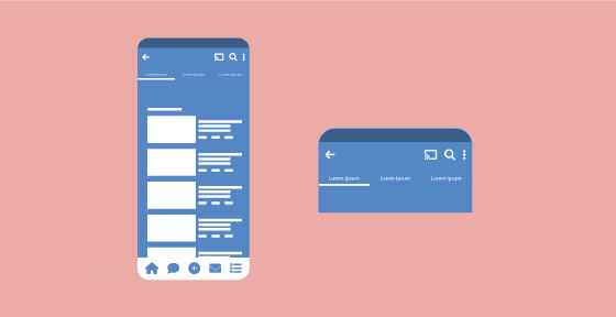
2. Bottom Bar Navigation
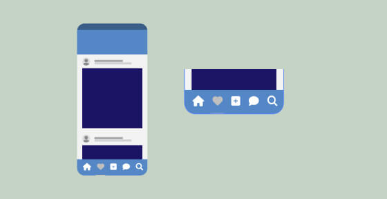
Bottom navigation is exactly that, a navigation bar that sits at the bottom of the screen, it combines primary and secondary navigation links. With a simple tap, users can intuitively explore and negotiate between top-level views. A reason why bottom navigation is so popular for mobile apps is that most users will be able to navigate with their thumbs comfortably while holding their device. It requires less strain and reduces the need to change the way a user usually holds their device, improving the usability of the entire product.
To reduce fatigue, most bottom navigation bars have between three and five destination buttons for quick access. Another argument in favour of this style of navigation s that it takes less effort to reach certain destinations within the design, with only a single tap required to get there.
3. Top Bar Navigation
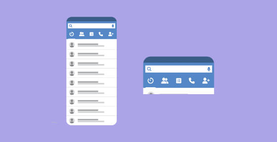
Top navigation. The flip side of the same coin to bottom navigation. This also consists of a navigation bat, only located at the top of the screen. Ut still offers most of the benefits that bottom bar navigation offers, minus the ease of use whilst holding the mobile device. With larger phones, many users will have to use both hands or change the way they grasp the device in order to reach all the links.
Like with many of the other navigation patterns on the list, top navigation is used in conjunction with another way of navigation. A silly but practical example might be when mobile apps use top navigation (for the most important links) and a secondary style of navigation (for secondary links). The top bar can signal to users that the link it contains are of the most importance. Particularly if the top navigation bar remains at the top of the screen even as the user scrolls.
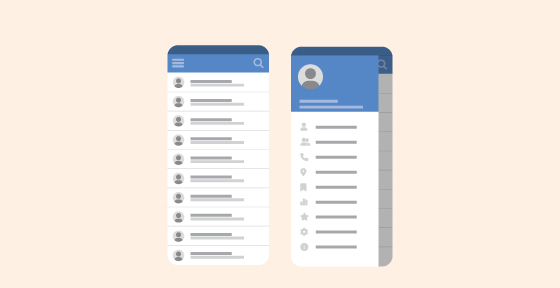
4. Card Navigation
Card navigation is a fantastic design pattern and can really make your mobile app interface pop due to its highly visual and customisable nature. It can present in many ways, different shapes and sizes are a great way to showcase various elements such as text, a link, or a photo in one place and has become a very popular app navigation. Spotify is a great
As content has become more compartmentalised and personalised over the last few years. Cards have been proven to be a great way to aggregate individual pieces of information all in one place. Furthermore, cards can be personalised to display different content.
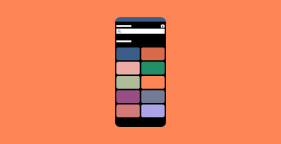
5. Tab Navigation
Tabs are not too dissimilar from navigation bars when it comes to UI patterns. They share the same layout, meaning a tab will be a row of multiple options leading to different screens. Where they differ, however, is a navigation bar will contain options that are unrelated to each other. Tabs on the other hand tend to have an overlying theme to them.
For example, in a navigation bar, you may have a home button accompanied by a search button, and a favourite button all of which will take you to those respective views. While unrelated these buttons represent key features of the app. Essentially, tabs are used to switch between alternative views within the same context. To illustrate, consider a tab system for an email platform. The first tab shows ‘primary’ seders who are in your contact list, while the second shows other senders whom you may not know. Two different sides of the same coin that deal with incoming emails.
6. Gesture-Based Navigation

Gesture-based navigation enables users to quickly swipe in their desired direction to navigate through an app or perform a particular action. As a UI navigation pattern, it has been around for a while, but gestural navigation really gained traction among app users with the advent of the popular dating app Tinder. Swipe right, anyone?
Users’ gestural navigation helps to create a journey between different scenes within an app and gestures include touching and dragging, both horizontally and vertically, as well as zooming in and out. It’s highly immersive and interactive which creates a dynamic experience.
A great advantage to this UI pattern is that it is relatively simple to grasp and even the most inexperienced users can use it, the gestures are intuitive and only require little experimentation to perfect.
7. Full-Screen Navigation

Many of the navigation patterns on this list are all about minimising the use of space. This is a completely opposite approach, dedicating much of the screen exclusively to mobile navigation. Sometimes referred to as a “navigation hub”, this approach works well to funnel users from broad sections of the product to very specific ones.
However, it is true that sometimes, so much navigation can be a tad overwhelming. Some designers can be adventurous enough to dedicate an entire screen to the app’s navigation, using careful visual hierarchy to avoid overwhelming users. It is a way to offer a lot of the navigation upfront in a coherent way, it can offer an opportunity to help users understand the product’s features all at once.
8. 3D Navigation

Last but by no means least, we have 3D touch navigation. It was first brought to users by Apple, who found a way to offer direct options from the home screen of the iPhone. It’s a way to create a navigation shortcut, showing the key actions for the selected app.
Another common use for this mobile navigation is the preview of the content. When dealing with a list of options for content, like an email inbox or a list of articles, this can be a good way to give the user a preview. It is worth remembering that central features shouldn’t be accessible only via 3D touch. Mobile navigation should still provide a clear path so users can find the primary features without having to discover the 3D touch option.
Best Practices for Mobile App Navigation Design
We have detailed a few best practices when deciding on a mobile app navigational style. They can help you create menus that are easy to understand and improve the overall mobile app user experience design. Convenient navigation has paramount importance from a usability perspective. These several mobile navigation tips can help you facilitate the design process.
#1 – Make the navigation understandable
When creating a mobile app navigation design, make sure that it’s clear and intuitive. It is better not to reinvent the wheel and use navigation UX patterns that most people are familiar with and used to seeing in other mobile apps. Intuitive navigation means that the user can easily predict what happens if they click on a certain button in the navigation menu.
#2 – Make Sure It’s Easy to Read
While most of the mobile app buttons have icons, some of them also have texts (words or phrases) that help users understand the consequence of clicking on this button at first sight. So, the designer should make sure that all fonts and text sizes on the buttons are easy to read and understand and abide by accessibility standards. Readability plays a significant role in the UX design, as it directly affects user satisfaction, it is considered when the user forms a first impression of the brand itself.
#3 – Create A Clear Hierarchy & Avoid Clutter
Clutter isn’t good under any circumstance. Small screens mean that it’s much easier to fall into the clutter trap. Neither in web design nor in mobile app navigation, chaos isn’t welcomed and must be eliminated. The visual hierarchy should be clear and straightforward. The user shouldn’t be second-guessing what will happen if they go to a specific category or button in the navigational menu. Visually cluttering content in the mobile app design may create user cognitive overload. So, it’s super important to keep the design and content integrated into it, to keep it easily digestible.
#4 – Carefully Select Your Icons & Labels
Ensure the intuitiveness of the icons and labels you are using for the mobile app navigation. The user must have at least a clue of what may happen if they click on a particular icon. Labels and icons should be associated with some objects that bring strong symbolism and make the app navigation easy to understand immediately.
#5 – Place Most Important Actions at the Top
When designing the long list with categories and actions etc, ensure you put the most important and the most frequently used at the top of the list. It’s a simple tip that seems obvious but can get overlooked.
#6 – Account for /finger & Hand Positioning
This is of vital importance for mobile apps. Users’ fingers aren’t always slim, but everyone must be able to use the app comfortably. Nobody wants to waste time by trying to tap on icons repeatedly and not being able to get anywhere. It is frustrating, and distractive and can ruin carefully planned experiences your design team has worked so hard to create. This means that your links and buttons need to be big enough for most people to be able to tap them successfully on the first try. The general advice is to install a minimum 10mm size to all buttons. Another thing to consider is the spacing between elements that support navigation. You want to make sure not just that everything is big enough, so users won’t stress themselves out when they try to tap. You want available space, so they don’t tap on random elements that are nearby.
Conclusion
The limited amount of space along with users’ high expectations regarding usability make a good mobile navigation design a tall order. The secret behind a successful mobile navigation design is the proper utilisation of its most important elements. You must keep your customer’s needs in mind during the design process. Remember that your success relies heavily on the satisfaction of your customers.
So, here we are after this extensive dive into mobile app navigation. Mobile app navigation is an interesting and vast concept, hope we were helpful to you so far.
If you are looking for the best UI & UX design services, we are always happy to help. Got a project you’re itching to get started, then let’s chat today.